Welcome to your Design System Style Guide

Style Guide Banner

How to use this resource

This design system style guide is a shared resource for all who work on Feeding America’s website. It is a reference point for designers and developers on approved brand colors and type styles. It can also be useful to content editors to see what larger blocks are available for page building. This page is not intended to replace or modify any brand guidelines found in the brand book or other FA guidelines, but serve as an example of its application.

Global Elements

Color


Active Colors

Brand

orange-500

Orange

green-500

Green

yellow-500

Yellow

neutral-600

Payne’s Grey

yellow-400

Pale Yellow

blue-200

Light Blue

blue-800

Medium Blue

green-700

Deep Green

new-cream

New Cream

neutral-100

Cool Grey

old-cream

Cream

white

White

red-500

Red

brown-500

Brown

brown-200

Sand

Additional brand color

blue-300

Pale Teal

Additional brand color


Neutral

To drive consistency on FA.org, we recommend adopting this neutral color palette for Feeding America’s UI elements. It is based on the brand color “Payne’s Grey.” Currently, the site contains many gray/neutral tones that were added over the years. This neutral palette will codify a color ramp that will map to shades found in the deprecated section of this page below and replace them, which will lead to a more unified and consistent experience across the site. These colors are not intended to be used as brand colors. They are intended for subtle UI elements to enhance the user experience of FA.org.

neutral-25

neutral-50

neutral-100

neutral-200

neutral-250

neutral-300

neutral-400

neutral-500

neutral-600

neutral-700

neutral-900


Deprecated Colors

The following colors are currently on the live site, added in years past. They should be replaced in code with Brand approved colors. The gray tones will be replaced with the Neutral color ramp above.

These colors should not be used to create new work.

background-grey

eb-light-grey

mostly-white-grey

wheat

e5-light-grey

light-grey

medium-grey

dark-grey

grey-dk

site-black

mostly-black

true-black

pink

link-hover

dark-orange

med-blue

darkest-blue

vddpink

purple

site-green-hocus

dark-green

muddy-green

strong-yellow

hover-green

green

very-dark-grey


Colorways


Colorways are color relationships between background colors, text, buttons and other elements. Using a block with a different colorway can help break up a longer page or change the tone. There are two colorways for use on FA.org

Development notes: defined in css/_elements/colorways.css. Variable names: .color-primary in CSS: var (--color-primary).

Green Colorway

color-primary

color-secondary

link-text

Error Message on

White Colorway

color-primary

color-secondary

link-text

Error Message on


Typography


Feeding America has two brand typefaces: Gotham (sans serif) and Sentinel (serif). For digital use on the website, we prioritize speed and use system fonts in their place. Gotham is replaced by Arial for the sans serif. Georgia replaces Sentinel for sans serif text.

Defined in tailwind-typography.json. Use classes in twig templates to apply styles, or tailwind "@apply" syntax.

Brand Header styles

.heading-xl

.heading-1

.heading-2

.heading-2--black

.heading-3--black

.heading-3 font-bold

.heading-3

.heading-4--black

.heading-4 font-bold

.heading-5

Brand Text styles

.utility-2xl

.utility-xl

.utility-lg

.utility-lg font-bold

.utility-base

.utility-base font-bold

.utility-sm

.utility-sm font-bold

.utility-xs

.utility-2xs


Utility Serif Text styles

.utility-serif-6xl

.utility-serif-5xl

.utility-serif-4xl

.utility-serif-3xl

.utility-serif-3xl font-bold

.utility-serif-2xl font-bold

.utility-serif-xl

.utility-serif-lg font-bold

.utility-serif-base

.utility-serif-base font-bold

.utility-serif-sm

.utility-serif-sm font-bold

.utility-serif-xs

.utility-serif-xs font-bold

.utility-serif-2xs font-bold


Old Header styles

.graphic-text

.h1

.h2

.h2-alt font-bold

.h2-alt

.h3-alt

h1

h2

h3

h4

h5
h6

Old Text styles

.intro

.label

.card-text-alt

.card-text

.p

.montserrat

.body-lg font-bold

.body

.base-lg font-bold

.base-lg

.base

.utility-md

Old header campaign styles

These are header classes used on '/all-campaign-blocks' as well as elsewhere on the site.

.h2-refresh

.h3-refresh

.h3-black-refresh

.h4-black-refresh

Old text campaign styles

These are header classes used on '/all-campaign-blocks' as well as elsewhere on the site.

.body-refresh

.body-tighter-refresh

.body-large-refresh

.utility-base-refresh

.utility-medium

.utility-base-bold-refresh


Spacing


Spacing values define the space between elements on the page. This can include space between buttons, between columns of text, or around an image. Setting a scale of sizes helps the page to feel cohesive and considered.

Development notes on spacing: .ts-py-block, .ts-my-block, .ts-py-block-sm and .ts-my-block-sm classes define block-level spacing. See tokens/tailwind-site-spacing, and tokens/src/spacer-tokens.json for definitions. All of the margin, padding and height classes use generated from these base values. They are also available as css and tailwind variables. CSS custom property name: --spacer-[size]. CSS custom property name: --spacer-[size]. Tokens are defined in: tokens/src/spacer.tokens.json

Size token Rems Pixels Reference
3xs .125 rem 2 px
2xs .25 rem 4 px
xs .5 rem 8 px
sm .75 rem 12 px
base 1 rem 16 px
md 1.5 rem 24 px
lg 2 rem 32 px
xl 2.25 rem 36 px
2xl 2.5 rem 40 px
3xl 3 rem 48 px
4xl 4 rem 64 px
5xl 4.5 rem 72 px
6xl 6 rem 96 px
7xl 7.5 rem 120 px

Grids


Developer notes: Defined in tailwind-grids.json. Use "xl:container p-site" for site container and padding.

grid | grid-cols-1

grid | grid-cols-2 | gap-default

grid | grid-cols-3 | gap-default

grid | grid-cols-4 | gap-default

grid | grid-cols-5 | gap-default


Atoms & molecules

The “Atoms & Molecules” section outlines larger UI elements throughout the design system including buttons, inputs, dropdowns, and cards that display a variety of content. These elements are present within the larger blocks or sections of your page builder.


Blocks (examples)

Blocks (paragraphs) available on various content types. The blocks below are from the most current pages in the Feeding America design system, from configurable “kitchen sink” pages so content can be updated without deployments. Styleguide Settings Admin

Landing Page 2.0 - Hero Blocks

Landing Page 2.0 - Hero Blocks


These are blocks that can be enabled for the first block of a page. Options include Immersive photo with text overlay, immersive video with text overlay, immersive image with dontation cta, or a 50/50 layout with image on the left and text on the right.
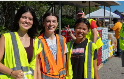
Image/Video Hero

Image/Video Hero

Food bank volunteer holding box of lettuce in front of shelf of produce.
Baby cabbage background image.

Make a Donation

Select donation type.

Landing Page 2.0 - Homepage/Body Blocks

Landing Page 2.0 - Homepage/Body Blocks


The following blocks are found on the homepage redesign. They have different configurable options and we are showing a select set of their options.

A grandmother and three grandsons, standing and smiling.
Belinda & Family, Virginia
Select donation type.

This 'Image with text block' has no title, is using the 'light grey w. border' palette, and has the 'Icon?' switch on.

98% directly to programs.

Landing Page 2.0 - Who Faces Hunger Blocks

Landing Page 2.0 - Who Faces Hunger Blocks


Landing Page 2.0 - Body Blocks

Landing Page 2.0 - Body Blocks


Many of these blocks are in 'Section Wrappers' - a kind of block that groups other blocks. They apply a common background that can help divide the page using different design elements. When you place content within a wrapper it will stay together and have a specific look.

Accordion

  • If you'd rather send your support through the mail, download and complete our donation form. Every envelope you send helps families across the country access food.
    Feeding America
    P.O. Box 96749
    Washington, D.C. 20090-6749

  • Prefer to donate by phone? Call us at 1-800-910-5524, Monday through Friday, 8 a.m. to 8 p.m. We're happy to help you make a meaningful gift.

  • Your legacy can help solve hunger—for good. A planned gift builds a future where every child, parent, and neighbor has the food they need to thrive.

  • Donate smart and save on taxes—gifts of stock can help you make a bigger impact for families facing hunger.

  • Turn your giving strategy into a force for good. Your DAF grant can help families move from hunger to hope.

Background Image CTA

Dramatic image CTA, Curabitur tincidunt, felis a elementum tincidunt, ex felis fermentum dui, eget pulvinar arcu eros eu eros. 


Hunger Blog Blocks

Hunger Blog Blocks


A smiling food pantry volunteer holds a box of fresh celery.

Full-Width Media Block, Image

Full-Width Media Block, Video

Form With Text

Cursus vel taciti blandit tellus suspendisse lacinia lacus ut gravida, maecenas suscipit curabitur pharetra facilisi viverra justo vitae

Donation Block

Lorem ipsum dolor sit amet consectetur adipiscing, elit vivamus eget purus porttitor, imperdiet fusce iaculis orci hac.

Image + Text with Background

Cursus vel taciti blandit tellus suspendisse lacinia lacus ut gravida, maecenas suscipit curabitur pharetra facilisi viverra justo vitae

A smiling Hawaiian woman holds a crate of fresh vegetables
Kaui, Hawaii

|