Interactive Data
The world around us is dynamic and filled with data.
Data is one helpful tool to analyze the complex relationship between food insecurity and socioeconomic factors, while data visualizations help us see and better understand that analysis.
This page showcases Feeding America’s growing data visualization library.
Leveraging the software Tableau, our dashboards explore the relationships between these important issues to inform program design and advocacy for policies that address food insecurity.
The Healthcare Costs of Food Insecurity
Many families experiencing food insecurity face multiple hardships that exacerbate the challenges to maintaining good health. Research using data from Map the Meal Gap and other national datasets indicate that food-insecure households face additional healthcare costs in every county in the U.S., totaling $52.9 billion in healthcare costs in 2016 – but this varies substantially around the country.
July 2019, Feeding America, DataBlick, Dr. Hilary Seligman, and Dr. Seth Berkowitz

Dimensions of Food Insecurity in 10 Communities
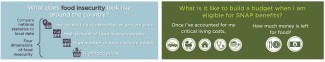
Each year, Feeding America’s Map the Meal Gap study estimates the number of people at risk of hunger at the local level using the most recent publicly available data on indicators of food need and barriers to access food. To add additional context to data available through this study, Feeding America built a visualization that highlights 10 communities with diversity in geographic region, demographic characteristics and economic makeup. Although food insecurity exists in every county in the nation, the experience of need is unique to each community
May 2019, Feeding America and DataBlic
Dashboard on Tableau Public | Companion Brief
Calculating a household budget with SNAP benefits
The Supplemental Nutrition Assistance Program (SNAP) is a critical resource for families struggling to make ends meet, but these benefits are not enough. To visualize the budget constraints for families with low incomes, Feeding America created an interactive tool in Tableau that uses local data on cost-of-living and food prices from every county in the U.S.
December 2018, Feeding America and DataBlick
Walk in the shoes of a person living with hunger
Hunger does not discriminate. While food insecurity is often boiled down to a single number, there are many faces and stories that live behind the data point.
2015, Feeding America and Nice & Serious
Interactive Story

Poverty and unemployment impact food insecurity
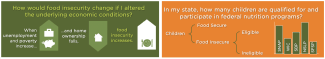
Food insecurity is driven by poverty and financial resources at both the national and local levels. When underlying economic factors change, data visualization tools can predict how food insecurity rates will react.
November 2018, Feeding America and DataBlick
Children are food insecure in every state of the U.S.
Child food insecurity remains prevalent across the U.S. While federal nutrition programs are one solution to the problem, the number of children eligible and served varies drastically across state lines.
September 2018, Feeding America and DataBlick